
Quick Review
Visual Design
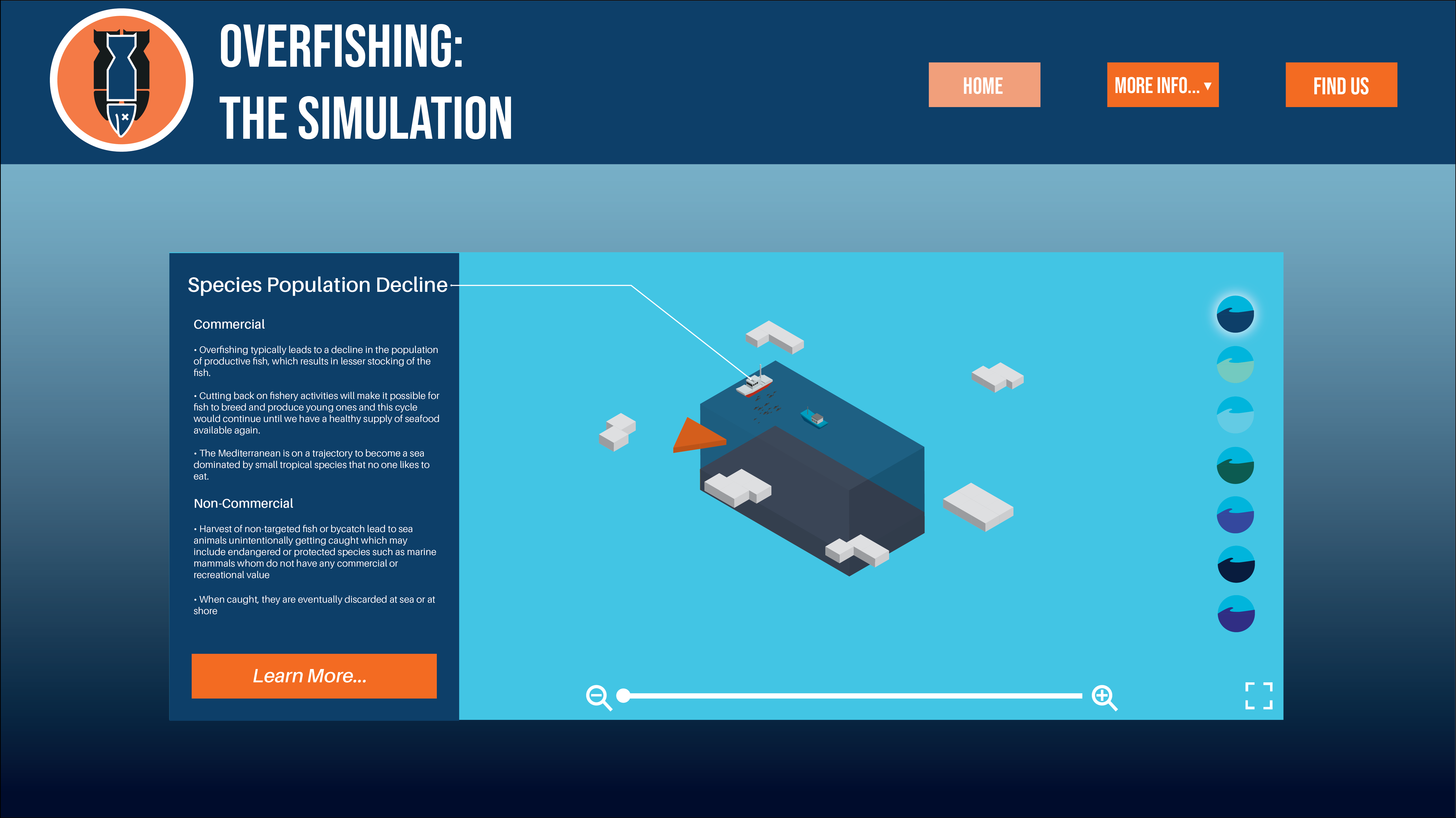
Colour Scheme
Annabel: Colours work well, I like the contrast between orange and blue…8/10
Lillian: Colours work well but I would suggest making the arrow brighter or lighter or bigger to make it more visible…8/10
Logo and brand elements
Annabel: Looks corporate very nice…7/10
Lillian: Very professional and suitable for target audience…8/10
Typography: Size, style and layout
Annabel: Typography works well together and suits the design…8/10
Lillian: Typography suits layout body text could be a bit bigger…8/10
Visual Design: Is it visually appealing?
Annabel: Yes, very nice…9/10
Lillian: Yes, very unique style of interactivity with the cubes…9/10
Usability
Does it help you learn something?
Annabel: Displays information in a unique way…9/10
Lillian: Yes, extensive information is present…9/10
Does it delight the user? Is it fun to use?
Annabel: Nice graphics…9/10
Lillian: Yes, navigating around the cubes is very fun and unique…9/10
One word to describe the interface
Annabel: Interesting
Lillian: Unique
Can you navigate successfully to all screens?
Annabel: Yes, easy navigation and clear/straightforward…9/10
Lillian: Yes, easy navigation system with the orange triangle…9/10
Simplicity and ease of use: Can you figure out how to use it quickly?
Annabel: Might be complicated at first, but due to it’s straightforwardness it becomes easier to use as you use it…8/10
Lillian: Yes, very simple to use… 9/10
Overall
Best thing about the project
Annabel: Branding- consistent and well-designed, works well for target audience
Lillian: The uniqueness of interactivity with the cubes
Thing that needs most attention
Annabel: Small things like the arrow and navigation, but not important
Lillian: Maybe make the arrow for navigation brighter
Conclusion
Although there are no visible changes made to my prototype based on the specific feedback listed above, you can view the drastic changes of my interactive from refined idea to prototype below.
Before 
After
