
Task Description:
We were instructed to provide three variations of our interface, making slight alterations to the layout.
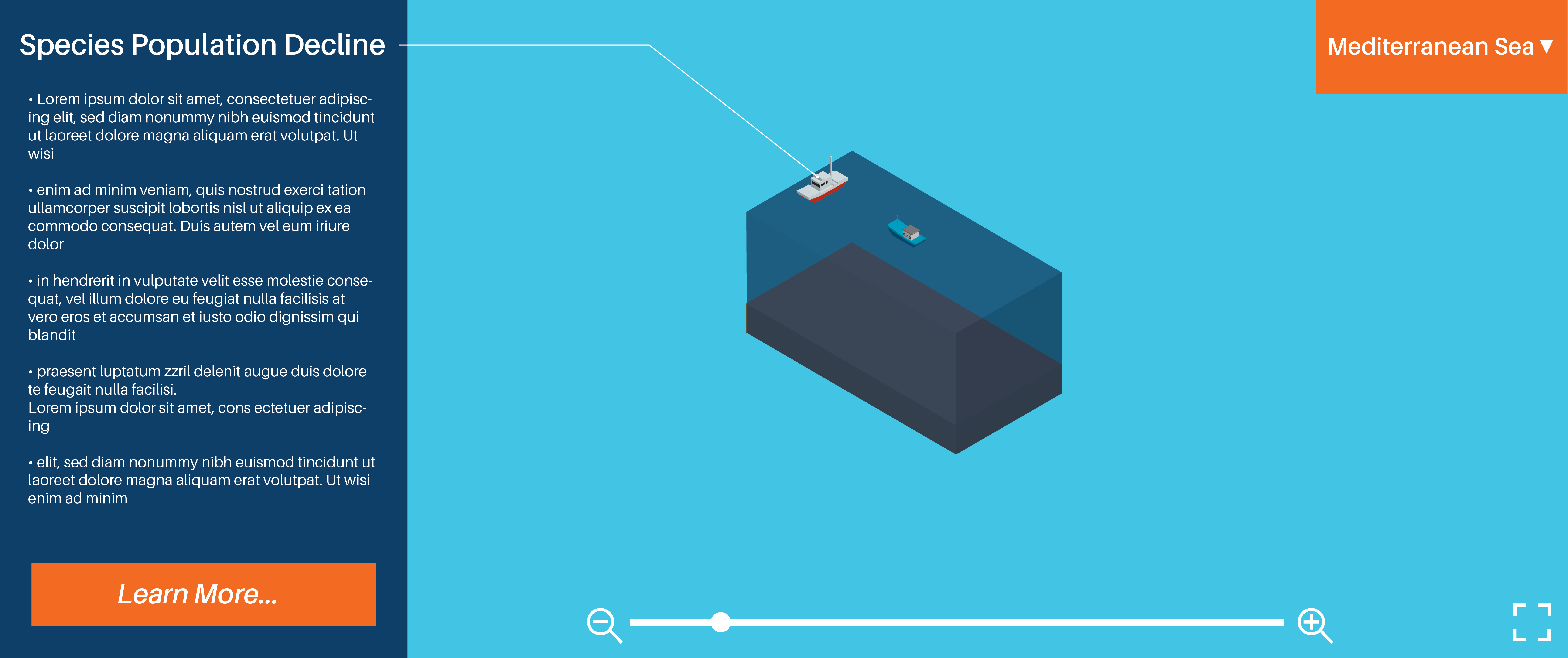
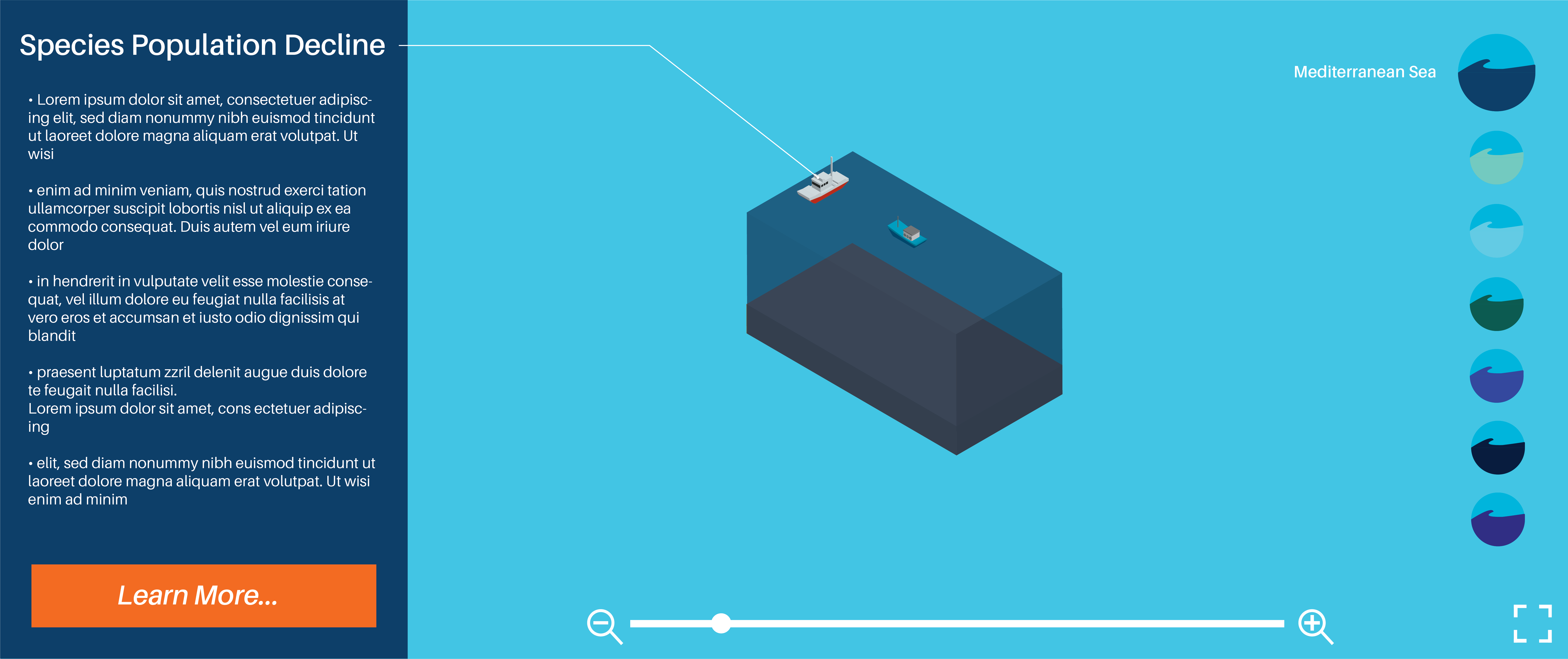
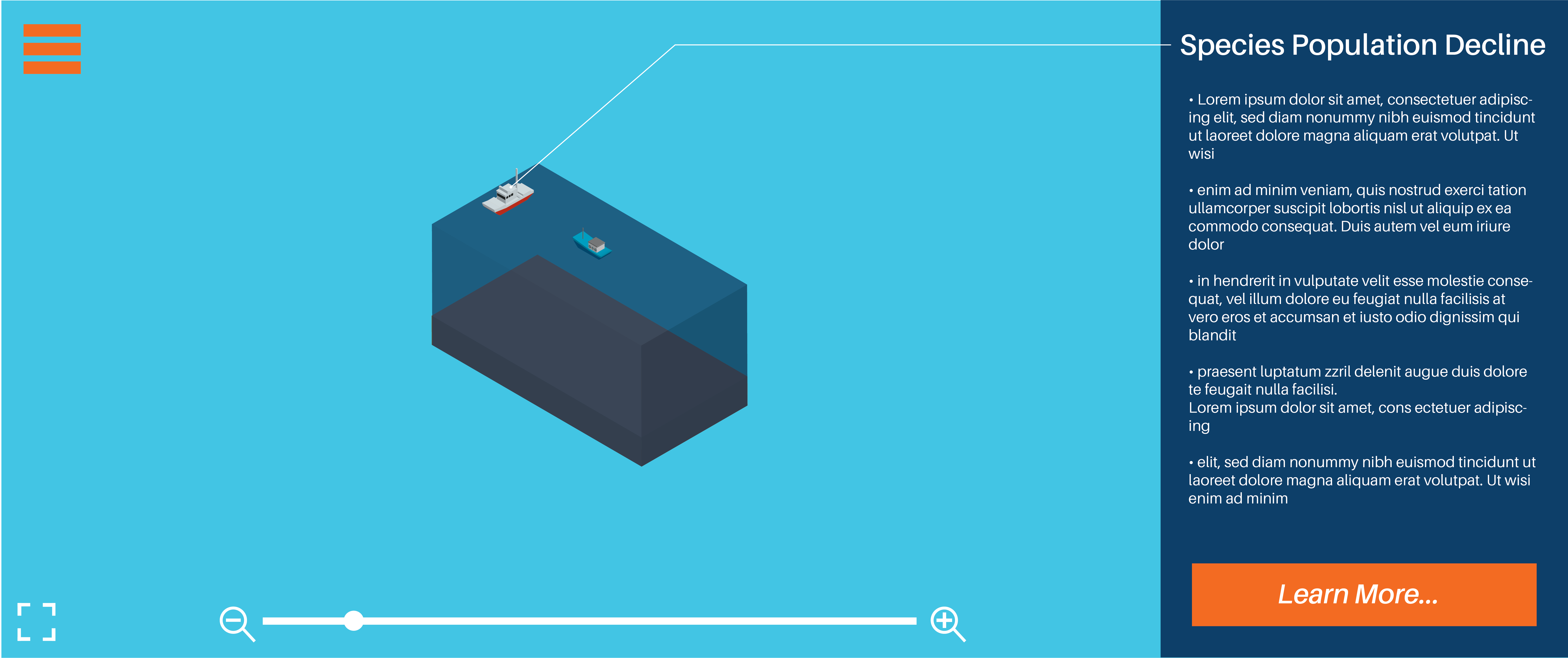
Interface Designs
Peer Feedback
Target Audience
- Easily identifiable as teens to young adults, works well for the wide range
- Colours work well, not too bright, meant for mature audience
Look and Feel/ Visual Design
- Nice colour scheme
- Easy, clear and direct layout
- Would prefer the 2nd Interactive Design over the 1st
Navigational Elements and Layout
- Easy to understand
- Clear
- Direct and straightforward
- Felt that everything had it’s own spot/place/section on the page so it’s not crowded
Colour Scheme
- Blues for neutral colour and orange for a pop of colour
- Gradient adds depth and mimics the ocean
Overall Visual Identity
- Branding wise, tells the audience what it’s about
- Straightforward
