Quick Review
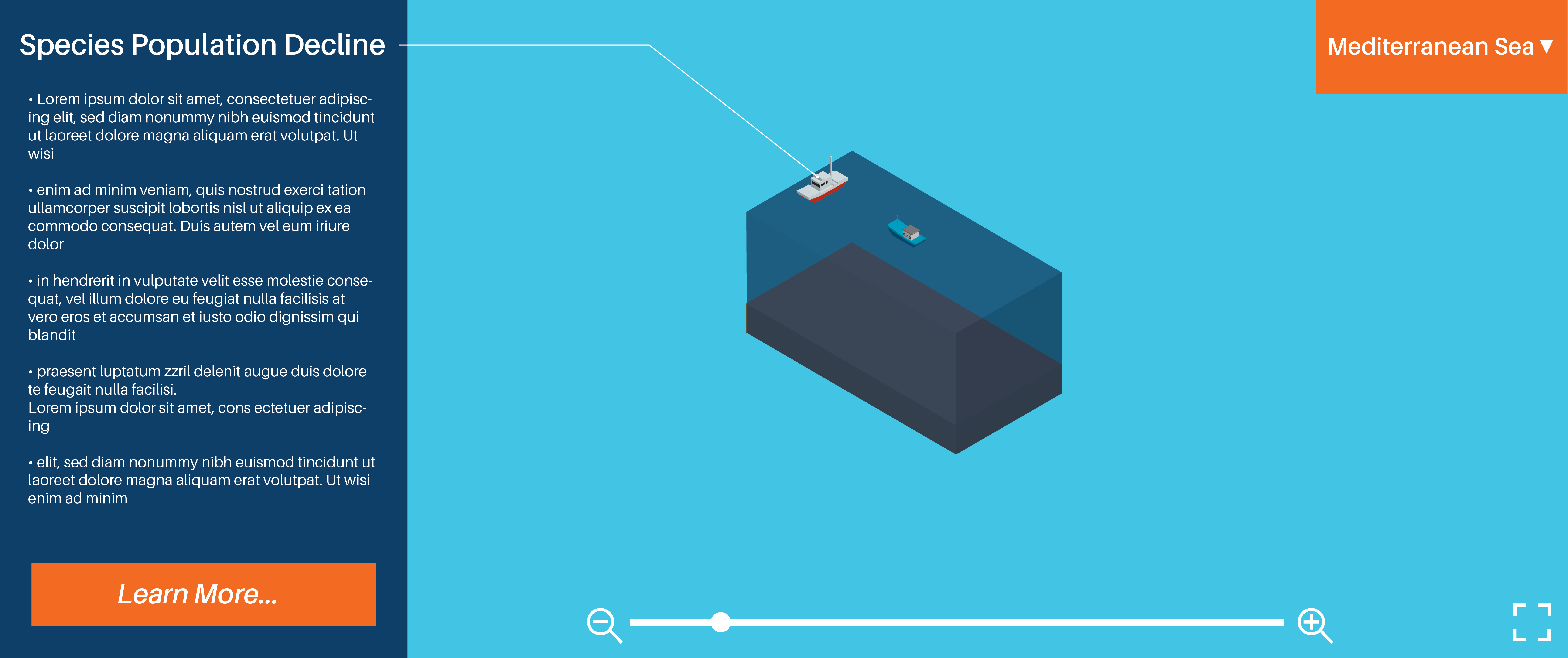
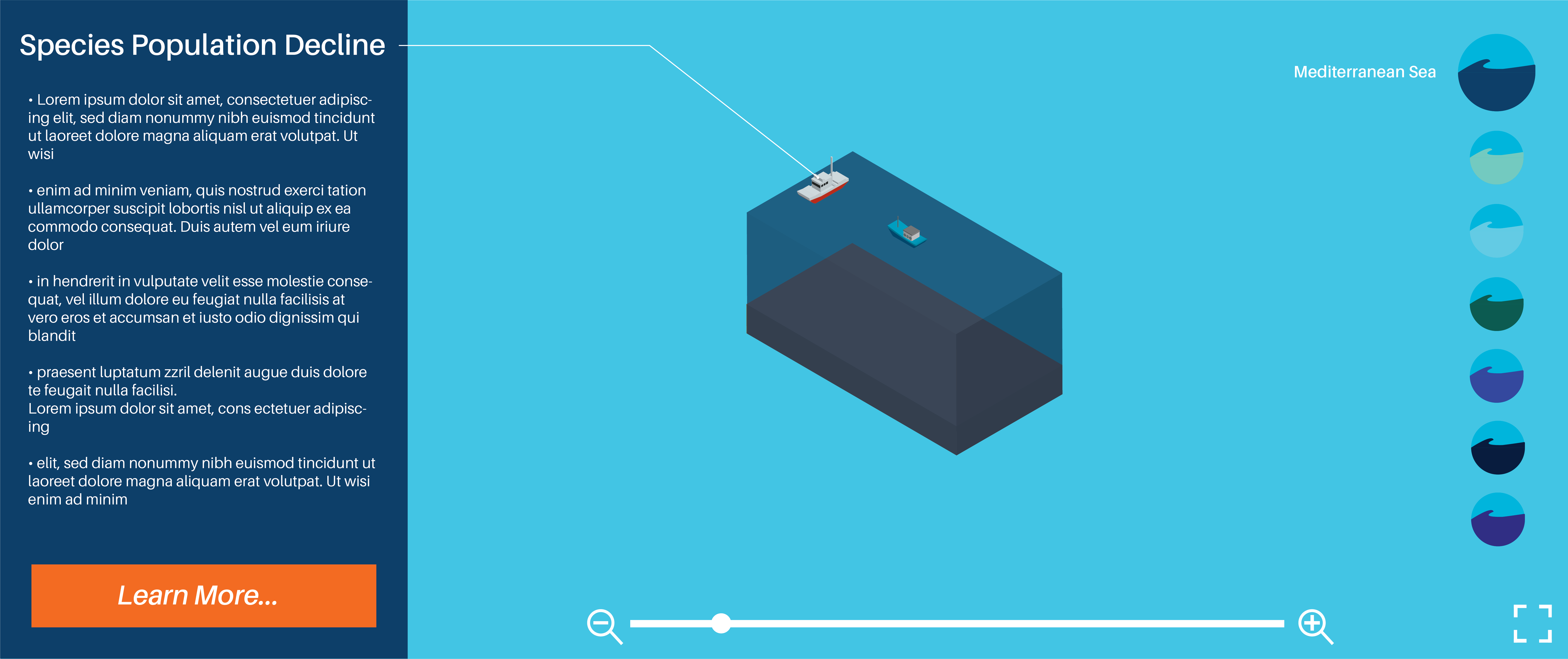
Visual Design
Colour Scheme
Annabel: Colours work well, I like the contrast between orange and blue…8/10
Lillian: Colours work well but I would suggest making the arrow brighter or lighter or bigger to make it more visible…8/10
Logo and brand elements
Annabel: Looks corporate very nice…7/10
Lillian: Very professional and suitable for target audience…8/10
Typography: Size, style and layout
Annabel: Typography works well together and suits the design…8/10
Lillian: Typography suits layout body text could be a bit bigger…8/10