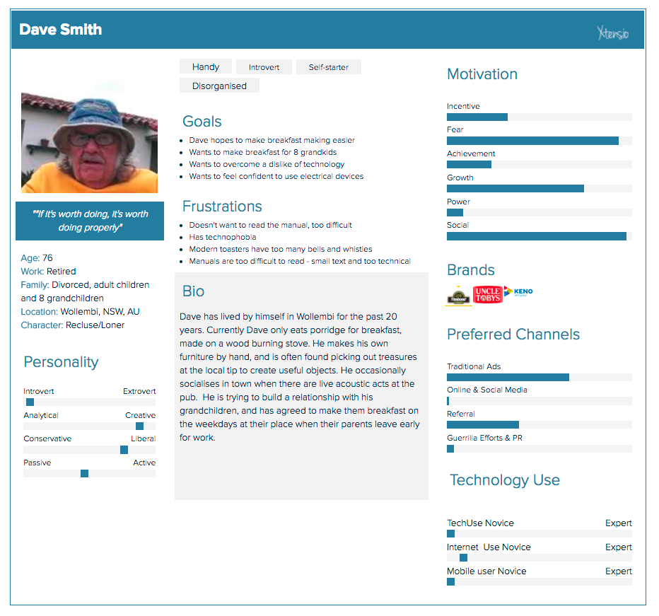
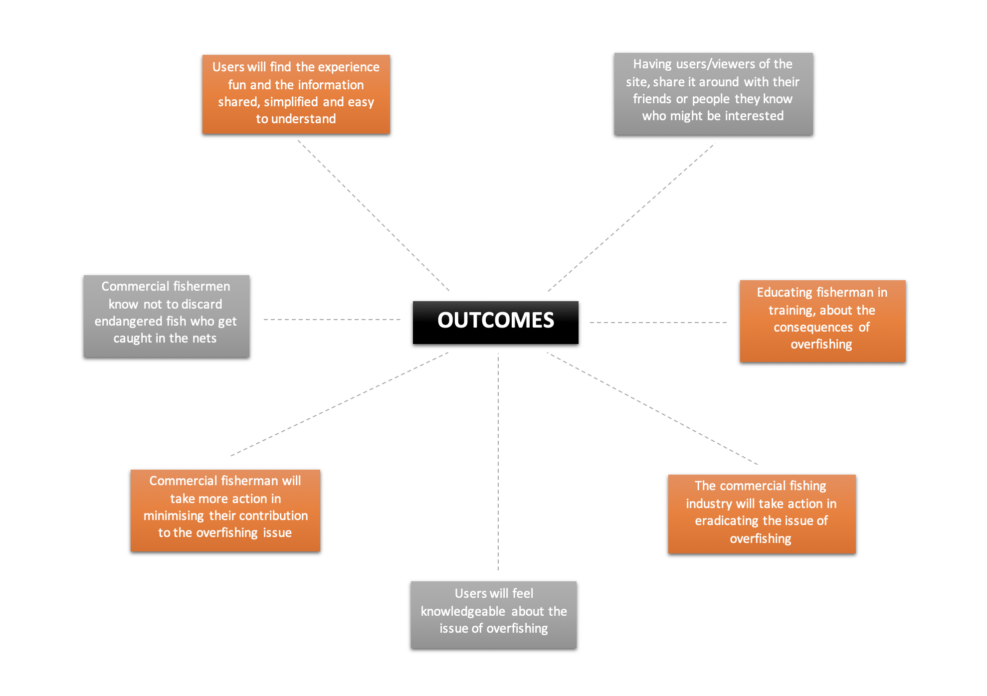
Phase 2: The Logo
After receiving feedback from my tutor after Assessment 2, he suggested I try out a variant of the logo that only used one colour. I experimented with logos that used purely orange tones and purely blue tones and found that the blue variant was more attractive. After comparing the monochrome logo with my original logo, I felt as though it was drowned out by the heavy use of blue in my interactive’s colour scheme and decided to stick with the original as the orange helps it pop more.

Official Logo VS Monochrome Logo

