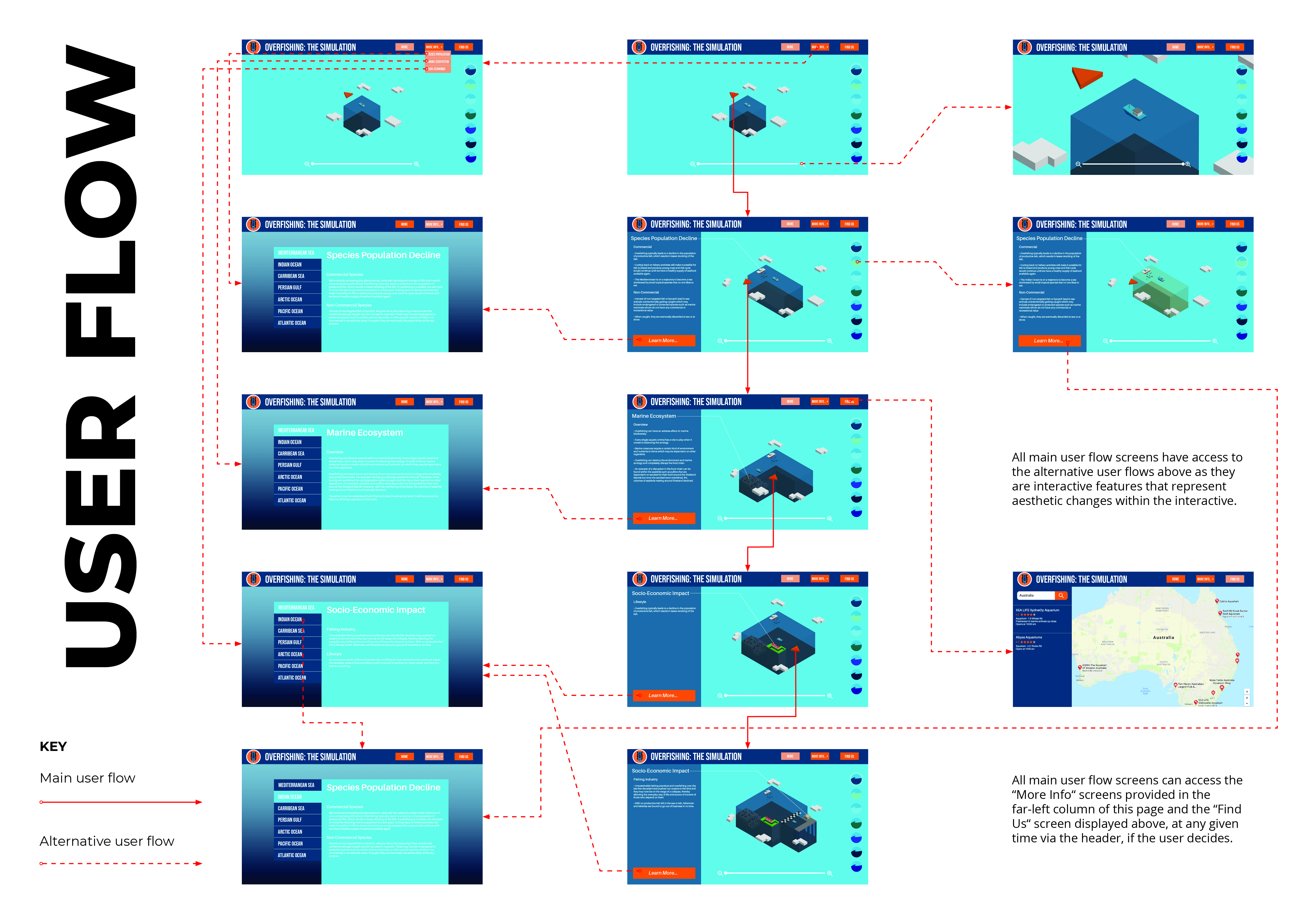
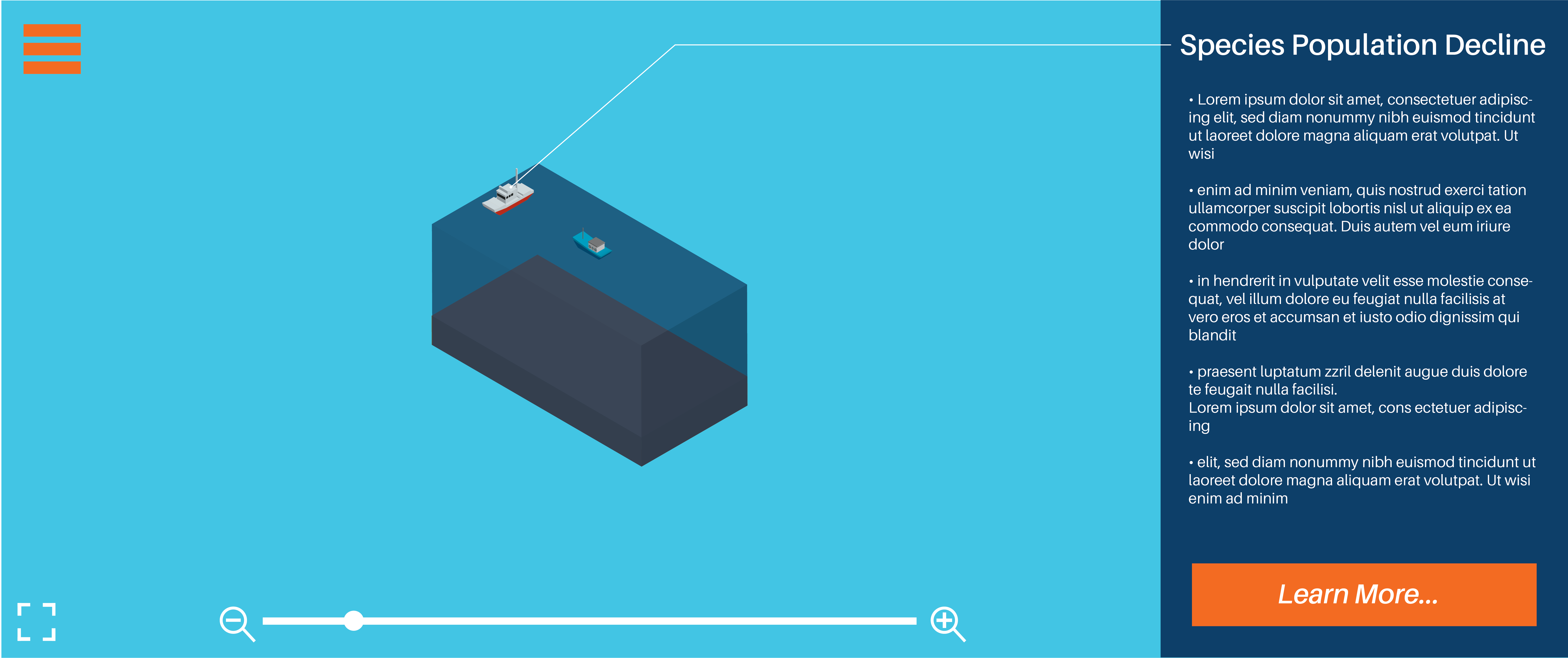
My interactive’s main user flow is completing the interactive itself. Anything located within the header (“More Info…” & “Find Us”), the “Learn More” button and the interactive features all serve as optional choices, deeming them as alternative user flow routes.
Annabel: Colours work well, I like the contrast between orange and blue…8/10 Lillian: Colours work well but I would suggest making the arrow brighter or lighter or bigger to make it more visible…8/10
Logo and brand elements
Annabel: Looks corporate very nice…7/10 Lillian: Very professional and suitable for target audience…8/10
Typography: Size, style and layout
Annabel: Typography works well together and suits the design…8/10 Lillian: Typography suits layout body text could be a bit bigger…8/10
After receiving feedback from my tutor after Assessment 2, he suggested I try out a variant of the logo that only used one colour. I experimented with logos that used purely orange tones and purely blue tones and found that the blue variant was more attractive. After comparing the monochrome logo with my original logo, I felt as though it was drowned out by the heavy use of blue in my interactive’s colour scheme and decided to stick with the original as the orange helps it pop more.
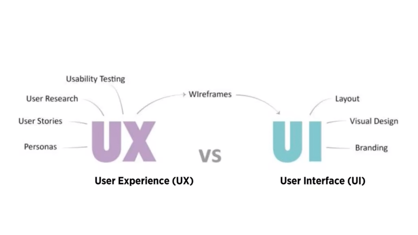
UI Design is the connection between the user and the experience, the first impression and the lasting impression that either makes a website familiar and helpful or forgettable and annoying
Good UI Design should strive for a balance between aesthetics and effortless interactivity, well designed interfaces should guide the user through the experience
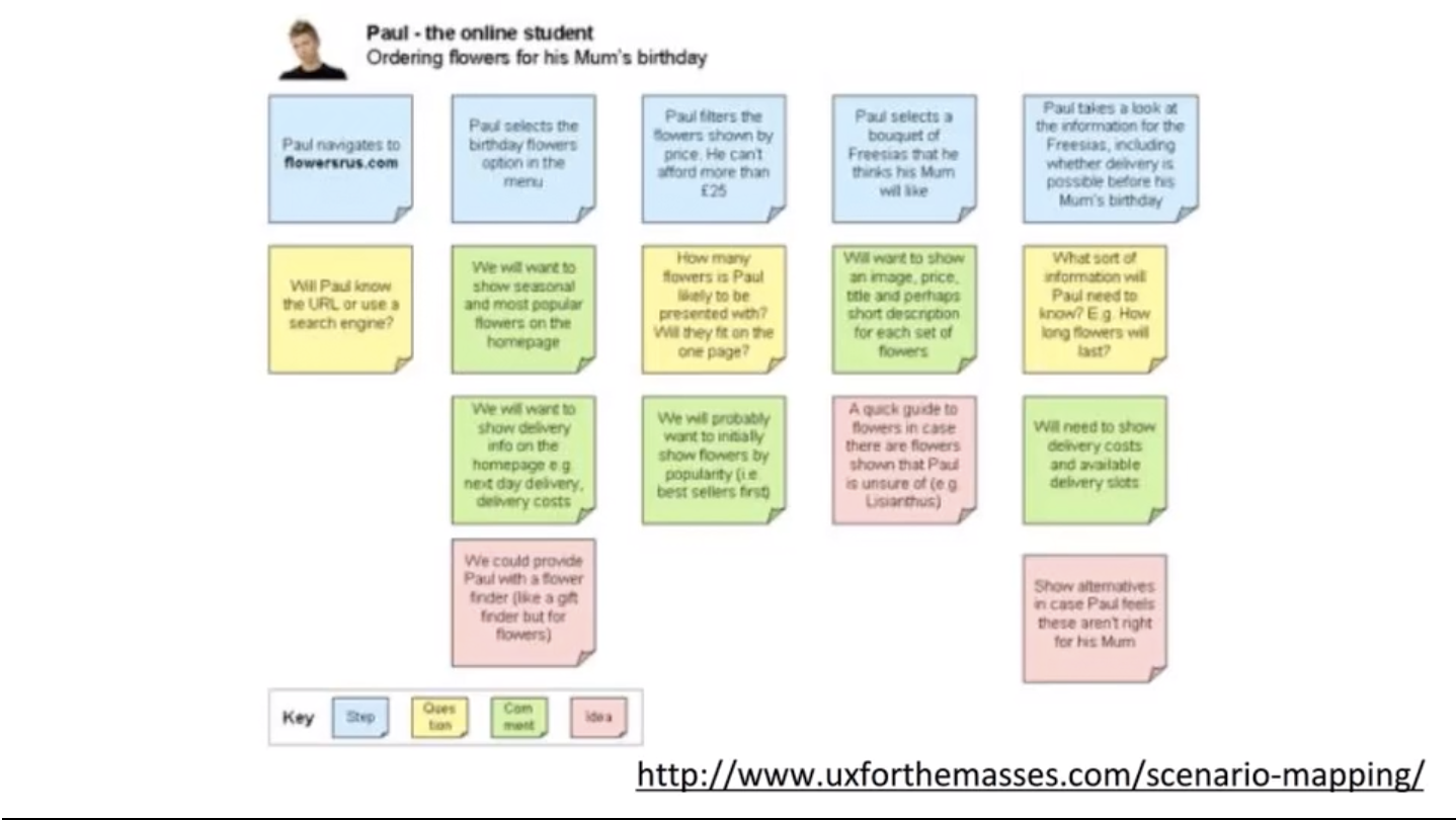
Thoughts and exercises, in which you predict how different users will interact with your website in a given situation in order to complete a given goal
Let you understand what your future users will look for when trying to complete tasks on your site
Provides visual representation of your problem when a user fails to perform the task to solve later
Allows you to test your site structure before it’s fully developed and isolate problems before they become problems
They should outline the Who, What, Where, When, Why and How?
We were tasked with first creating a combined moodboard based on our two user personas, then to sitemap our website/app and lastly, creating wireframes of our key pages within our website/app.
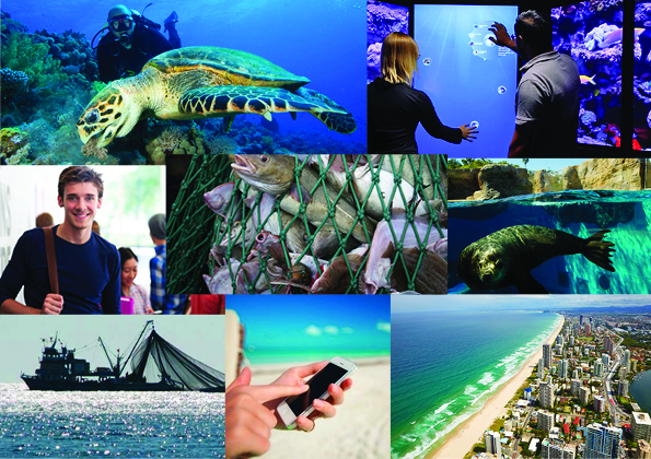
User Personas Moodboard
Moodboard based on my two user personas
The moodboard above is based on my two user personas, the first of the two being a university student studying marine biology and the second being a zoologist. I used images that addressed the personas, their technological approach to the interactive, their locations, their occupation, and the issue they are wanting to learn more about.
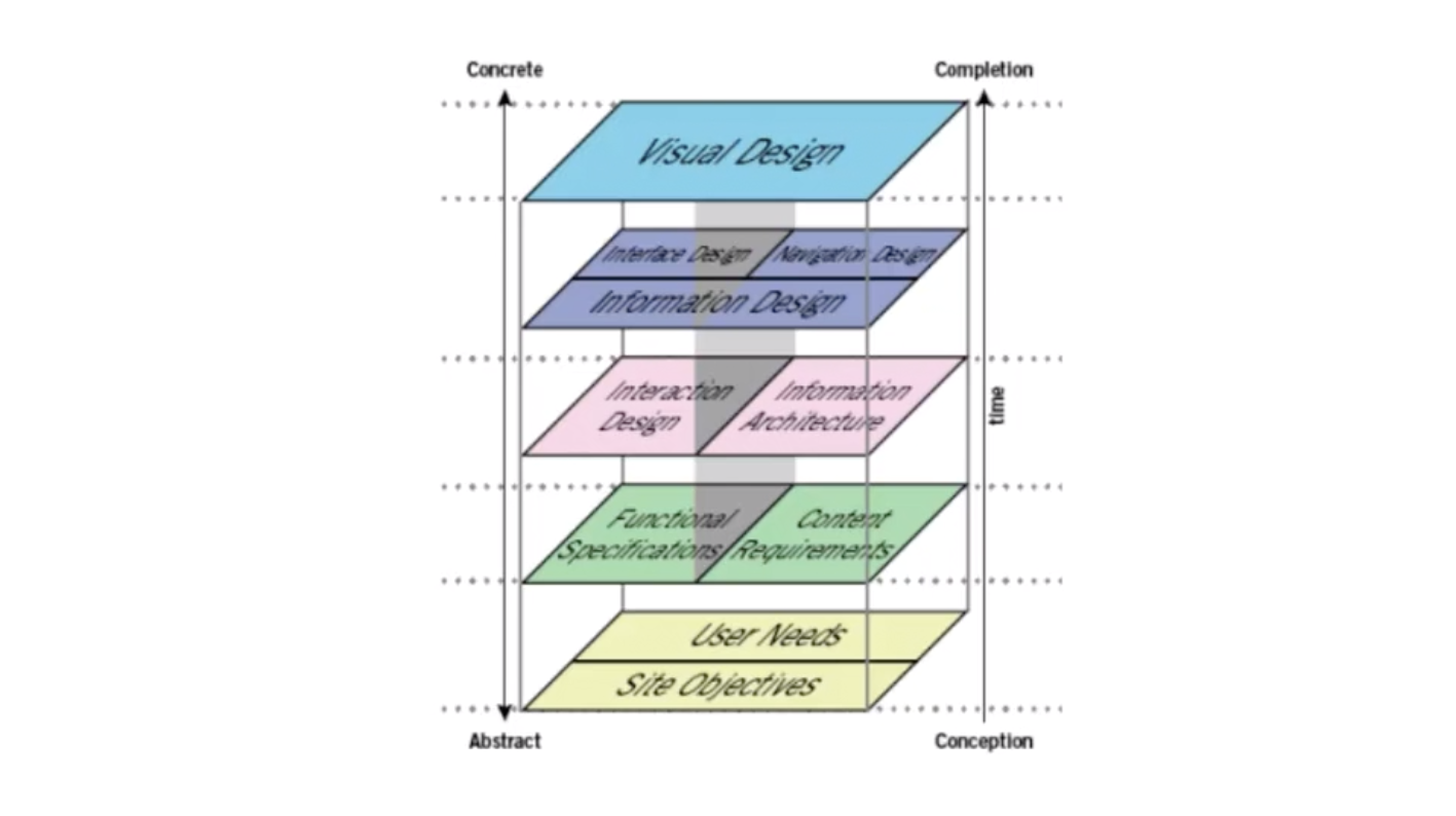
Overview of the interactive media design processes
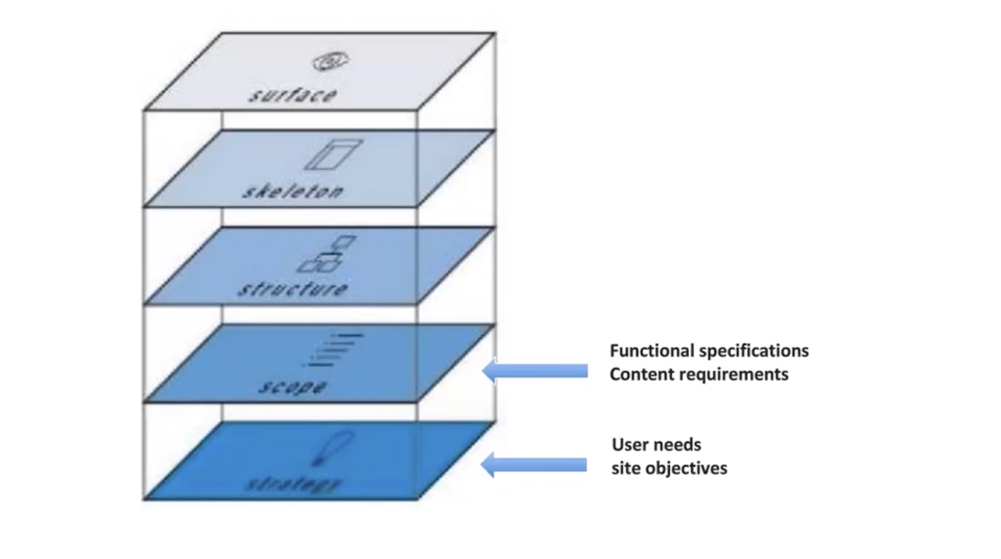
User experience design model
Above provides two diagrams, the first being an overview of the interactive design processes and the second being a refined version of the prior into a user experience design model.
User Persona: Fictional users representative of our real users who we reference throughout our creative process to inform and validate our design and user experience. They represent the goals and behaviour of a hypothesised group of users, synthesised from data collected from users, including behaviour patterns, goals, skills, attitudes, and the environment or context with a few fictional details to make them realistic.
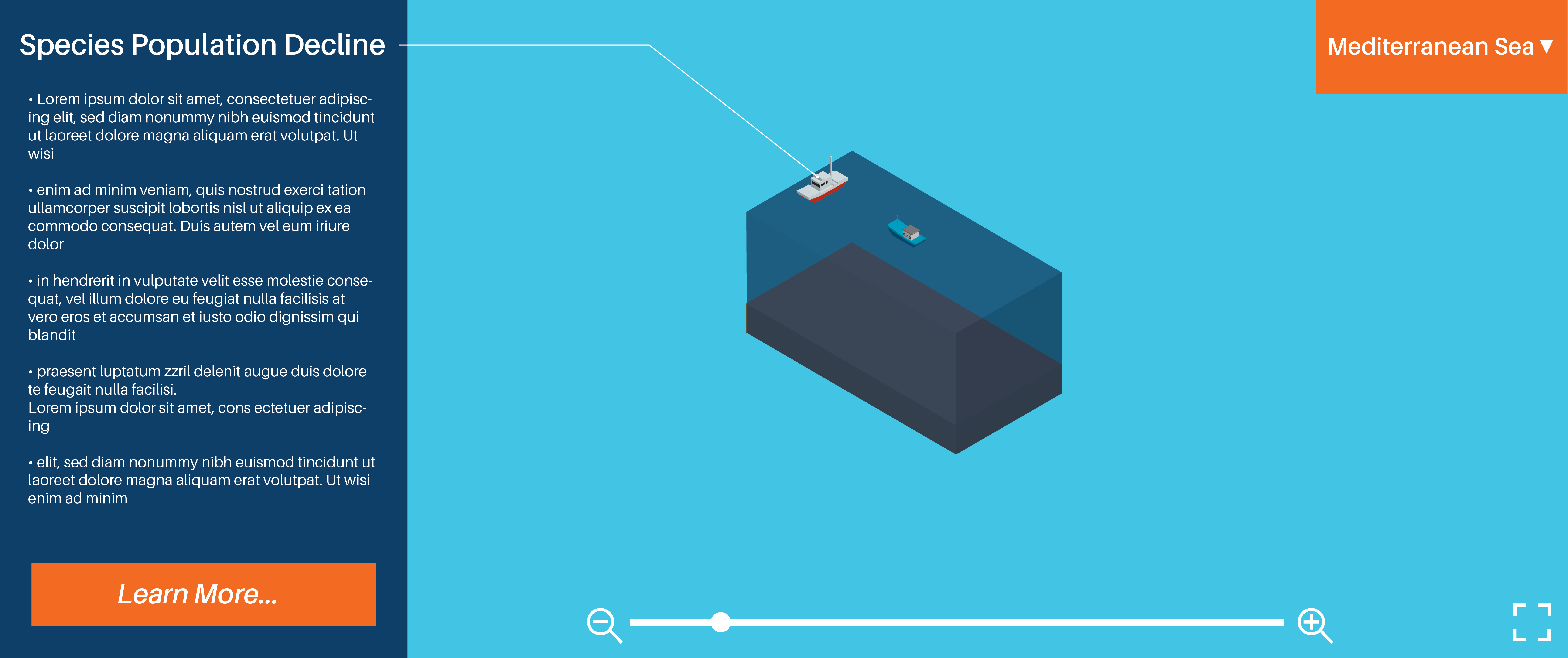
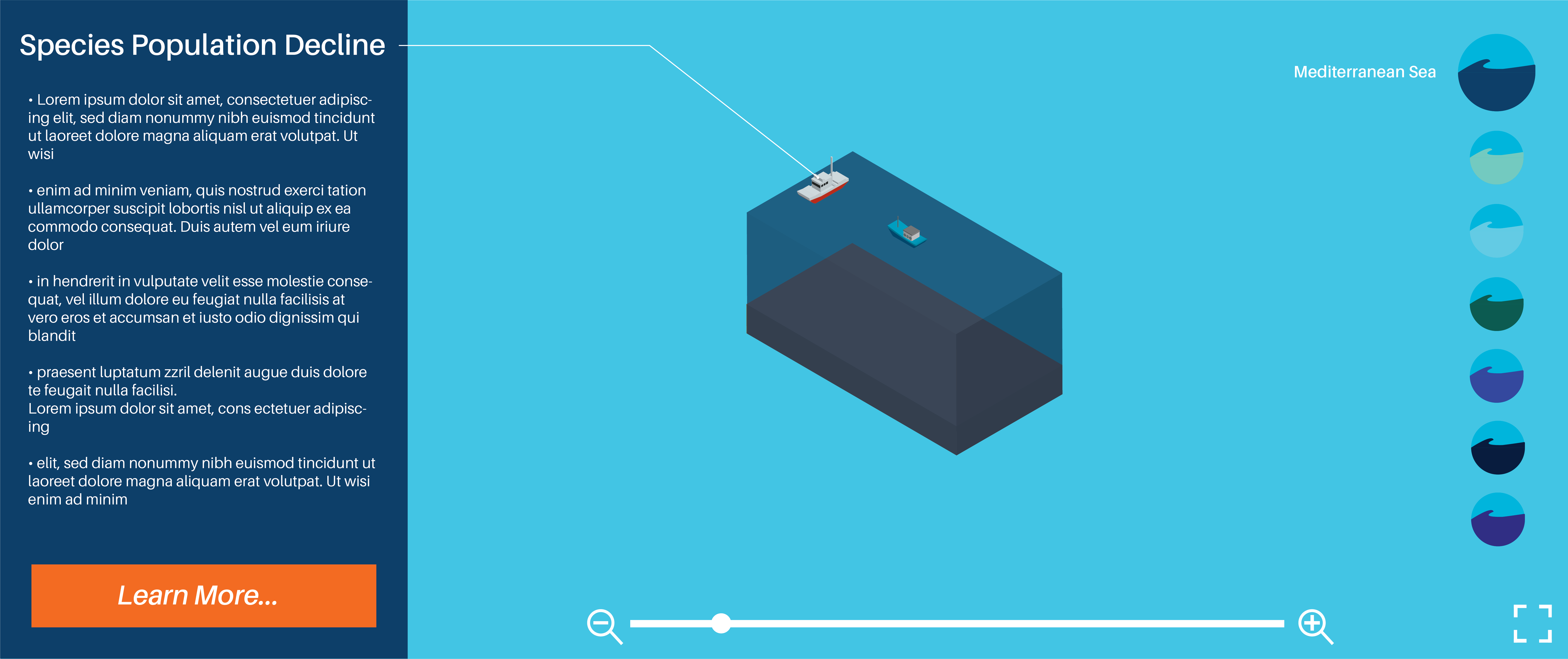
It addresses the issue of plastic litter within the ocean
The interactive is about demonstrating where floating debris in the ocean end up over a span of 10 years depending on what part of the ocean you click on
Who is it designed for? (Target Audience)
The website is designed for teens – adults as the interface is quite gimmicky while the information provided is in depth, informative and detailed
People interested in finding out more about ocean pollution
What knowledge does it assume of the target audience?
The colours indicated by the cluster communicate the severity in the amounts of debris (red = large amount / green = light amount)


 Ethan's Blog